About Me

My photo
hello my name is jessica, but jess is what i am known as !I survived my first year at university and am now working hard in my second year at my textiles degree! I come from a large family, so theres always something to blog about right?! Primarily it'll be my textiles work, but somedays i may just be too busy to write about my hectic day! Happy, busy days!
Showing posts with label fashion and textiles museum. Show all posts

Friday, 5 October 2012

Print research

From looking at the colours i blogged about the day before i started to look into 1960s as this was the period these photos were inspired by. Looking through some photos and my notes from the past few days i remember one of the girls in class mentioned the fashion and textiles museum of which i went and saw a printed exhibition there. This encouraged and excited me too look into my findings as i was yet to use them to inspire my work.
 

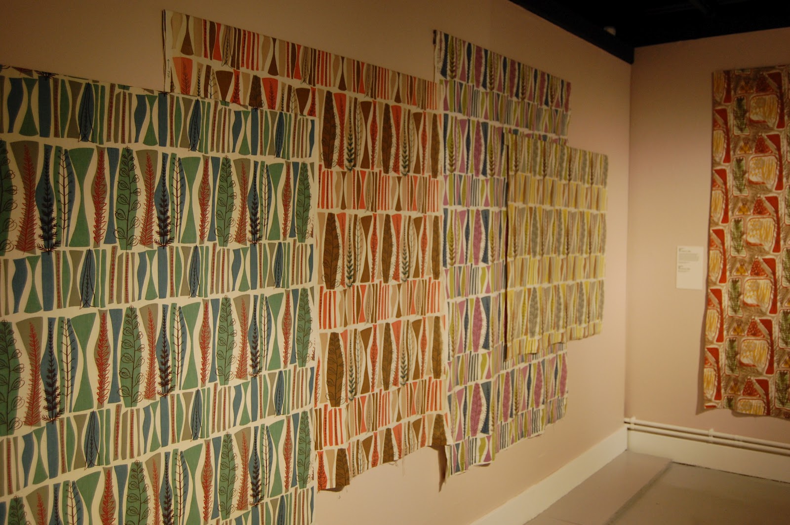
Mary White was a popular post war textile designer in the late 1950s and 60s which fits in nicely to the colour scheme i am looking into and the types of print-layered and repetitive. The exhibition was small and intimate so i was able to evaluate and look into the work as much as i could, and really take on board the colours and shapes. Taking the photos was a great reference, and now i am happy to be able to include these into my current work. It is slightly different, but i have learnt that research (along with drawing) should not be a direct translation/link but a reference, a source that i can interpret to 're-invent' something.


Small environment for an exhibition at the Fashion & Textiles Musuem.


 A collection of the same prints but all in different colour combinations. It just shows how different a print/piece of work can feel in different colours and shades, each one emmits its own feelings and attitudes.
 
Although the colours are not directly the same as previous, they are a lovely and appropriate link into what i am looking at. I am looking at layers of prints in fun and interesting ways - block colours and linear layers with strong accent colours. By looking at a range of work i can fully understand and appreciate what works well and what works best for the context of my work.
 

'The Printed Square' exhibition was also being held at the fashion and textiles musuem at the same time. The exhibition was a colaboration with textile designer Nicky Albrechsten and Oasis for the Spring/Summer 2012 collection and they were off square printed hankerchiefs. It was really interesting however i don't feel i benefited from it's full aims whilst there as i wasn't as heavily involved in printing in my first year and therefore didn't appreciate it as much as i do now. Now i have had time to experiment within my own work and our second year has introduced us to new and challenging printing techniques that i see these printed designs in a 'new light'.
 

 I love how each one is different, some being very linear in pattern, some being photo realistic, some block,abstract and some that were more detailed than others. Seeing all these photos again has given me alot to think about.

Thursday, 29 March 2012

London market research day. 27th March 2012

I went to London on Tuesday with one of my friends from university. We went for a textiles market research day and set about to visit galleries and exhibitions, including the design museum, fashion and textiles museum, saatchi gallery andthe fashion space gallery. We had a very long day but i got some inspiration from it!

Design museum:
Cost: £5


He made really intricate prints, most of his work was printed onto rayon and he used similiar techniques. I really like the look of them due to the intricate and the detailed patterns coming together! I also like the use of linear lines over bold prints.

Fashion & Textiles Museum:
Cost: £5

Lucienne day designed these prints. I love how she has used layering within her work. The background unites everything together with the white creating a bold contrast to highlight the subject on each of them. The print then stands out onto the white and on top of that she has used a clear black linear line adding in intricate detail. I am keen to give this a go! It looks very clever and adds in a lot of brightness and colour!
 These printed designs were made by Mary White named 'coppice' in 1954! I love the different combinations of the same print; you can really see visually how versatile they are!
Looking down at the exhibition!


 These hankerchiefs are absolutley adorable! there was a whole room full of these printed hankerchiefs... They are a modern take on vintage artists such as Lucienne Day and Mary White. The designs were done by Nicky Albrechsten who collaborated with Oasis for their spring/summer 2012 collection. They were absolutley beautiful you wouldn't want to use them!


 Fashion Space Galley:
Cost: Free

 This was the exhibtion i was most keen in seeing as i knew Felicity Brown was exhibiting some of her work!


I love the layering & i especially love how she's blended the colours together, the use of vibrant colours onto a natural looking fabric really creates a statement and the dashes of colour are eye capturing! I want to create a sample using layering as i feel the lightness of the fabric represents birds and feathers!


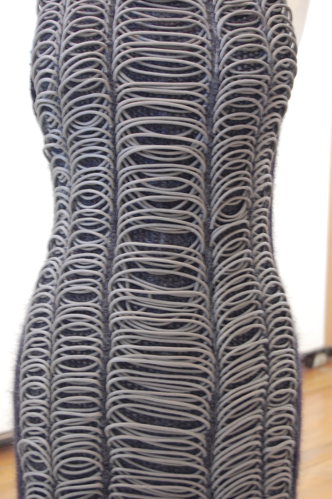
Again loving the use of layering here; and the dashes of not only colour but of the bold prints.Chi chi Lou has made use of knotting and plating within her work here; she plays on the idea of the ripped silk and the stitch are a form of construction and the use of beads are a symbolic represntation of Tibet (a recent trip she had and was inspired!) Eleanor Amoroso has developed the ancient technqiue of macrame to create minimalistic sculptures.


Close up of the fabric & the clothes.Love the different surfaces being created here using similar materials:)